Decorating with tone-on-tone colours
Call it tone-on-tone or monochromatic colours, choosing the same colour and using different tones to decorate a room has a calming and pure effect like no others will.
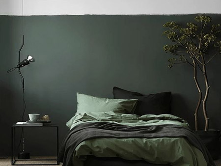
Whether you lean towards the calming tones of green for your bedroom or would love your living room to be awash with blues that are as deep as the ocean or as light as the sky, decorating with tone-on-tone colours will evoke a connection with nature.
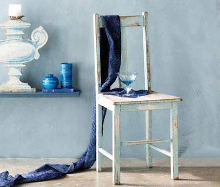
Blue, in all its forms, be it cobalt, navy, royal, aqua or eggshell, is a meditative colour and green evokes harmony, making both perfect for a bedroom. All shades of blue work well together. Deep inky blues offset turquoise shades and a dash of white brightens everything. It is the subtle contrast between colours that makes this tone-on-tone approach so refreshing.
Bring in a breath of fresh, seasonal air with flowers in shades of the same colour: think hydrangea, cornflower, iris and lavender for starters. Living with blues and greens isn’t about matching shades, as the effect may look contrived. It’s the subtle contrast between colours that makes this tone-on-tone approach so refreshing. Blue, in all its forms, be it cobalt, navy, royal, aqua or eggshell, is a meditative colour and green evokes harmony, making both perfect for a bedroom.
The key to keeping the tasteful, understated feel of a tone-on-tone decorating scheme, while updating with colour, is to make sure that all the colours are in the same family as each other. For example, if you have white walls and pale blue or grey furniture, and you choose to add deep blue cushions or accessories, make sure any other new accents are in the same range of blue.
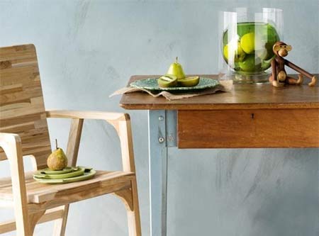
There’s a growing global trend for harmonious colour combinations, particularly using tones of blue with other tones of blue as well as shades of green with green. Mixing it up with natural elements such as timber, which itself has lots of variations in both colour and texture, relaxes the look, making it a perfect palette for the way we live in South Africa.
Texture is an integral part of tone-on-tone decorating, be it in the scuffed-up paint on a treasured kitchen chair or the mottled pigment of a chalky wall, texture adds warmth through the suggestion of age.
pinterest.com/pin/408279522462696767/
The key to making tone-on-tone work is balance. Pattern is wonderful but aim for a ratio of 30 per cent pattern against 70 per cent plain if you want the space to feel calm. Think slick and shine. For example, a grey-glass coffee-table top against the rough-and-tumble texture of a wheat-coloured rug. Consider a cream silk pillow on a brown velvet sofa, or vice versa. Although the colours themselves are all subtle, a contrast in textures is what attracts our attention.
If you love the understated elegance and soothing feel of using different shades of the same colour there are some things you can do to update it without losing the overall effect. You can add several different shades of a particular colour and create a tasteful tone on tone look. Your room will retain the same calming essence, but it will gain some visual interest.
Add interest and give a room some depth by adding patterns and textures. Fabrics, in different tones as well as different prints are more eye-catching and help move the eye around the room. The key to mixing patterns is to use similar shades of colour, and similar sized patterns.
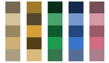
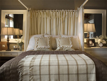
Texture breaks up the monotony and gives the space some character. Shades of beige, cream and brown make for a restful, comfortable master bedroom. Creating a tone-on-tone palette is as easy as picking up paint colour swatches and choosing one color you like, then go one value up and down from that colour in the spectrum.