
What is a colour wheel?
A colour wheel is a very useful tool if you are going to be doing any home decorating.
Choosing paint colours can be a confusing experience, leaving you racked with indecision as you peruse paint swatches and try to figure out which colours will look perfect on your living room wall. The color wheel is designed to make it easier for you to see the relationships between different hues.
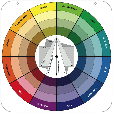
Even in today's open-plan homes, where kitchens, living rooms, and dining rooms are often one large space, colour is used to help define interiors and create focal points in relatively featureless rooms. The trick, of course, is figuring out which colours to use and where to put them. Start by selecting three colours from a favourite object in your home. It can be a cushion from the family-room sofa, your favourite scarf, or a painting - anything that conveys comfort or has an emotional connection for you.
Pop along to your local paint supplier and pull out three paint swatches with those colours, and you instantly have 15 to 18 colours you can use, since each sample strip typically contains six paint colours. The next step is to choose one of the three paint colours as your wall colour and to save the other one for fabric or furnishings, and use the final colour as an accent colour.
If you find yourself confused or unable to choose your colour sample cards at the paint store, look at the darkest colour at the bottom of the strip. If you like this one you know you'll like the middle and top, but if you choose by looking at the top, lightest colours, all the cards in that category start to look the same.
Once you have your colours sorted, consider the finish you'll be using. Though today's matt paints have increased stain resistance, conventional wisdom has long held that a satin (also called eggshell) finish is best for walls because it is scrubbable and doesn't draw attention to imperfections.
Semi-gloss and high-gloss finishes, it was previously thought, were best left to the trim. Today, however, finishes are also being used to create visual effects on the entire wall. Paint one wall in a matt or satin finish and the adjacent wall in a semi-gloss, both in the same colour. Similarly, you can paint the walls matt and the ceiling semi-gloss to achieve a matte and sheen contrast. (The ceiling will feel higher the more light-reflective it is.)
Keep in mind that the higher the gloss, the more sheen and the more attention you draw to the surface. Used strategically, colour and gloss together can emphasize your interior's best assets.
this old house