
Decorate with classic colour
Colour palettes may change each season, but classic colours remain true favourites for decorating a home. Let's take a look a classic colour combinations that never go out of fashion.
pinterest.com/pin/113997434298592043/
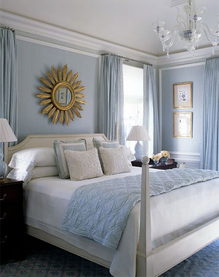
True blue and white
This colour combination's history is rooted firmly in the export porcelain that made it popular, and, even today, you can scarcely open a home magazine without seeing blue-and-white china in its pages. When translated to a room, it is sometimes nautical, but always chic. To keep it current, try combining deep cobalts with pale aquas, and, of course, don't forget to add plenty of white.
pinterest.com/pin/238972323956643658/
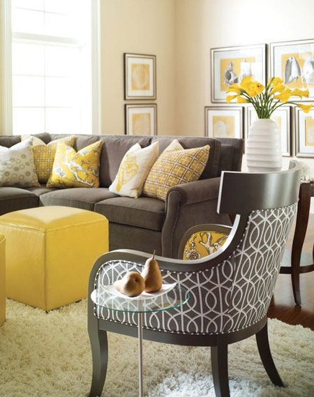
Not-so-mellow yellow
When paired with rich browns, yellow's sunny disposition takes on an air of maturity without losing an ounce of cheer. Yellow reflects sunlight, making a dark room appear brighter.
pinterest.com/pin/165296248796058023/
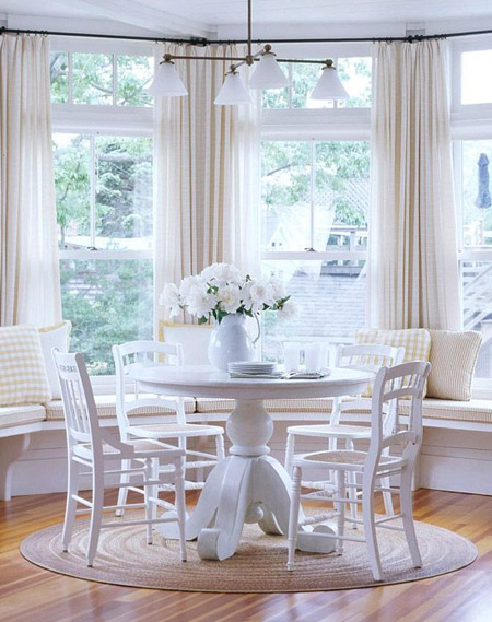
Try it white
Always crisp and definitely cool, the colour white speaks of a care-free summer, but can be beautiful year-round. A chic, all-white room may seem easy to achieve, but looks can be deceiving. To do it successfully, add plenty of texture and a little shine - such as a seagrass rug and metallic lamps.
pinterest.com/pin/146367056621733647/
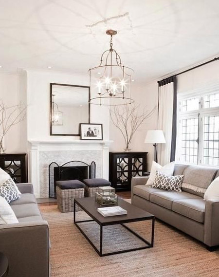
Grey matters
Though this moody colour may evoke images of stormy, unpredictable skies, its recent incarnations are a bit more cheerful. When grey leans a bit toward green, it pairs nicely with blues, white, other greens, and yes, even orange.
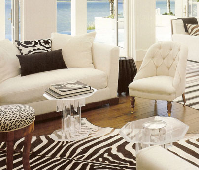
Black and white is just right
This user-friendly colour combination can be found in many applications. From black-and-white photography to zebra-skin rugs, it seems there is no end to its possibilities. Art is an easy way to bring the sophistication of black and white into your home. For a little more drama, add in accent fabrics. If the pattern is overscaled, it will make a bold statement, while smaller prints can have the effect of a neutral.
pinterest.com/pin/575053446159889042/
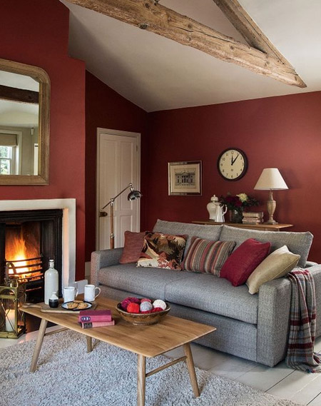
Red all over
Bold and intense, red is the reigning drama queen of colours. It is the colour of passion and power, and definitely isn't for the faint of heart. Because of its reputation for stimulating appetites, red is often found in dining rooms. One way to ensure that red won't overpower a room is to pair it with an equally dramatic colour, as this chocolate brown dining room illustrates.
pinterest.com/pin/298715387765845388/
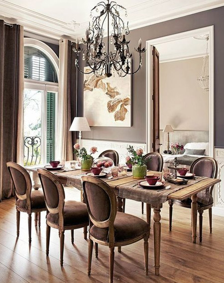
Neutral territory
Viewed by some as anti-colours, caramels, camels, taupes, and browns continue to have a place in home and fabric design. A fitting backdrop for art, antiques, and accessories, neutrals can be very effective when executed well. This restful living room is a study in texture and patina. A linen velvet tuxedo sofa is accented by silk pillows, while the 19th-century French chairs are covered in a simple linen. Layering a graphic rug over seagrass keeps things interesting, while bits of metallic finishes (on the clock, sconce, and frames) add glamour.
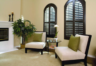
Black magic
It is said by some that no room (or outfit, for that matter) is complete without at least a touch of black. Whether or not you subscribe to that philosophy, there is no denying the importance of black. Bits of black in accessories and hardware can give a room a sense of permanence, but be sure to break it up and keep it from looking too serious.