
Use Colour Palettes – And Create Exclusive Interior Styled Spaces
Being in one space for an extended period such as lockdown, puts a spotlight on your surroundings and often stimulates new insights for creativity and the use of colour.
15/06/2020
Kim Williams a local South African entrepreneur, behaviour specialist and an interior creative, celebrates the use of vivid colours as a way to create a unique identity for interior spaces. Kim is well known for her ability to use vivid colour palettes, sentimental pieces, and repurposed vintage treasures in her unique schemes to create an exclusive tone and a unique identity for each space.
Colour is an essential creative tool and there is no bigger colour event than The Pantone Color Institute’s announcement of the colour of the year. The anticipation and excitement in the creative world before the release of the colour of the year bonds a variety of creatives such as designers, architects and marketers; serving to keep the industry alert, connected and inspired.
The colour of the year was born from Pantone's colour classification system and these days colour companies play a pivotal role in how we experience colour.
As the world of branding evolved, the importance of how we use and live with colour began to affect the way we dress, the schemes in our homes and we began to recognise the impact that colour has on our moods. The colour of the year inspires designers, captures the industry’s attention and shines a spotlight on shades both new and old.
In 2018, Ultraviolet purple was completely new and unprecedented while in 2020 the use of Classic Blue was an already emerging trend.
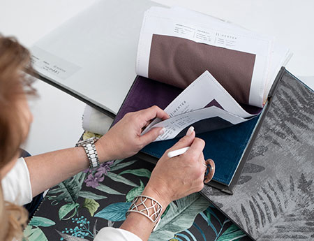
Colour can motivate the items and elements you use in a space. As a professional creative, Kim is constantly seeking inspiration to feed her creativity, sparking new ideas and direction. She was particularly inspired by Classic Blue - as it fit with her love for bringing classical elements, such as repurposed vintage items into her schemes. A key aspect of her style is mixing these vintage elements with more contemporary ones to create intimate and meaningful spaces.
When Classic Blue was announced as the colour of the year Kim was in the process of moving her home office, meaning that she had a new space of her own to play with. Serendipitously, she had also just been given a gorgeous painting by a client that had a pop of Classic Blue in it. Inspired by the colour, the blank canvas of her new office and the beautiful painting, her new workspace was born.
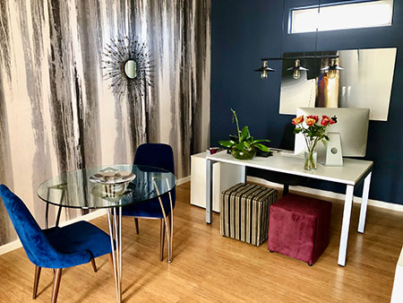
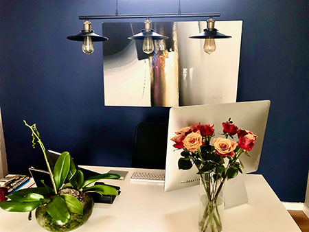
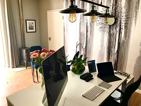
The wall behind her desk is an elegant Classic Blue and boasts the beautiful piece of art. A traditional black light fitting over her desk allows for a bright space that will not cast a shadow on her computer screen and showcases her practical nature as it frees up space on the desk. Her signature sentimental item, a sleek modern desk, sits proudly in front of the wall and holds special significance both in the space and in her life, as it was the first desk she could afford to buy new with the profits from her now successful design business.
Vintage black and white photographs salvaged from an old guest house play off the black accents in the painting, and soft sophisticated velvet chairs sit around a glass meeting table in front of a fantastic white, blue, black and grey mural from U & G fabrics.
Marrying the classic and the contemporary can be challenging to achieve. When you choose a colour for a room you need to envision what it will look like in terms of layout. The bones of a room are always fundamental so spending money wisely on structural renovations is always a good choice as they can influence the return on investment of the property.
The structure and pieces that you have, your budget and the mood you want to create are all crucial considerations when refreshing any space. Repurposing vintage pieces may not always be the cheapest option so when you are budgeting make sure you include repurposing furnishings and budget for the entire design process.
Colour is an incredible gift and can change the way you feel about almost anything instantly. The colour selections you make in your home should always add impact to the rest of your space and work cohesively to connect or highlight the different spaces in your home. If like Kim you are mindful about these elements and use the Pantone colour of the year as inspiration, your home is sure to be a masterpiece.
For more about Kim Williams and to sign-up for her blog visit www.kimwilliams.co.za. Follow Kim on Facebook and Instagram @kim_williams_design.