
Choose the perfect Colour Palette for your home
See how easy it is to select the perfect colour palette for your home interior based on mood and atmosphere.
30/05/2019
https://pinterest.com - 600386194054584553/
When decorating the interior of your home, you want to choose the perfect colour palette. It's easy to do this using the following guidelines:
01 Select your inspiration
When planning to decorate the interior of your home, it is always a good idea to make a Mood Board or digital folder - or even a pinterest account - where you can keep a selection of images that you love from magazines and online interior decorators.
Where the images collected show the colours used, make a note of this, especially due to the fact that colours that you view on your phone, laptop or tablet almost always look different in real life and can vary dramatically from the actual colours used.
https://pinterest.com - 711639178599176023/
If you have spotted a colour you love, to match the colour as close as possible, take the image to your local Builders or paint store and match to the closest paint swatch on their colour display section.
https://pinterest.com - 290482244715826082/
02 How you use the rooms
Did you know that the colours you choose in any room will have an affect on the atmosphere and energy of the space? It is well known that warm colours of the colour spectrum such as red, orange and yellow - add energy and are ideal for those rooms where you want to create an uplifting, stimulating and social atmosphere.
Colours from the cool side of the spectrum such as blue-green, blue and purple have a more calming and relaxing effect and are perfect for rooms that receive a lot of natural light.
https://pinterest.com - 755338168733591618/
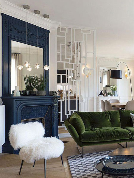
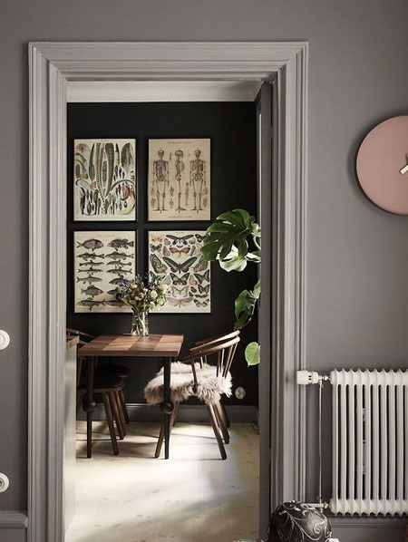
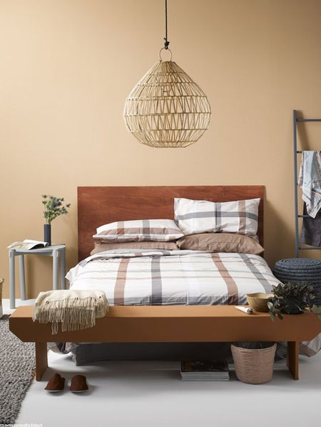
03 Size of the rooms
When selecting a colour palette, it is important to bear in mind that lighter paint colours usually work best in large rooms, since a small room painted with dark colours may be too overpowering. However, if you love the richness of dark colours, these can be used in a small room to add more interest.
https://pinterest.com - 76350156167285770/
When you want to make a small space appear larger than it is, cool light colours, like sky blue, have an effect where the colours recede - making a room appear larger than it is. On the opposite side, warm rich colours like red, bring walls closer in.
Bold warm hues at the end of a passage would be a good choice if you wanted to make the long passage appear shorter.
https://pinterest.com - 184295809738086147/
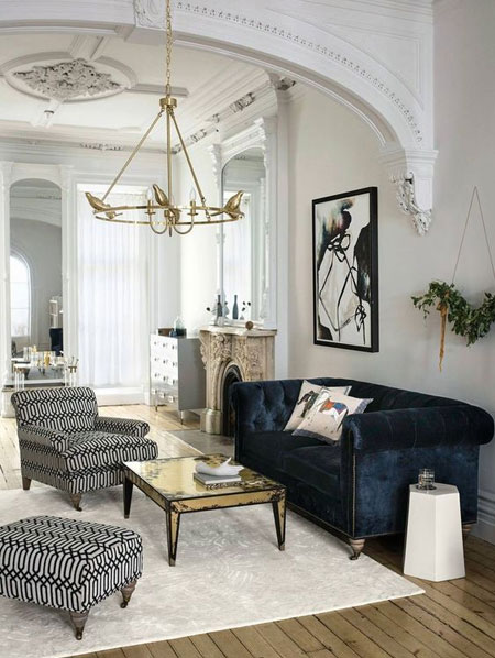
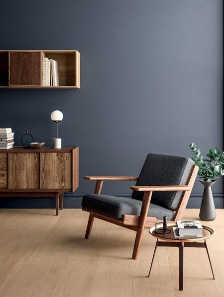
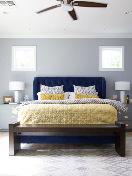
04 Is the room warm or cool?
Use specific paint colours to affect the perceived temperature of a room. For example, if you are looking to paint a naturally cool bedroom in a hue of blue, look for a shade that has a warmer undertone so that the room does not appear even colder than it already is. Rather add lots of warm accents in orange, red to add extra warmth. This choice of colour works in the opposite for a warm room - red and orange will make a room feel warmer than it is, so look at adding cooler accent colours.
https://pinterest.com - 632263235167475139/
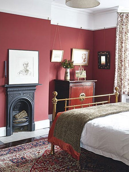
05 Choose colours that tie in
With a fully furnished room it is easy to select colours from what is already in the space - like a colourful rug, fabrics or an interesting piece of art. Use these to help you pick a paint colour. This will create a more cohesive and considered colour palette.
https://pinterest.com - 155303887138850814/
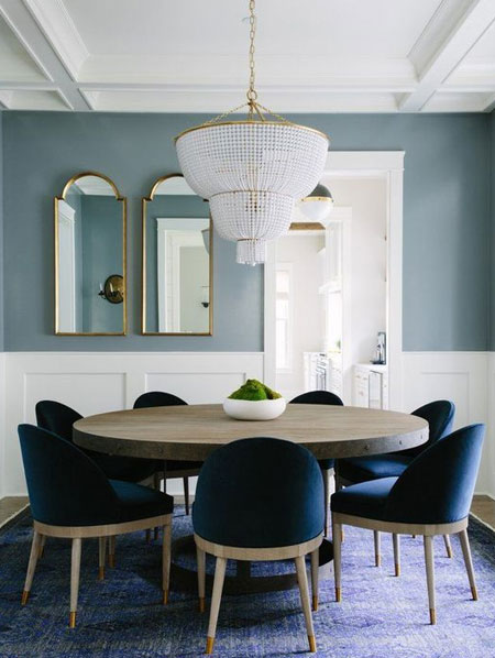
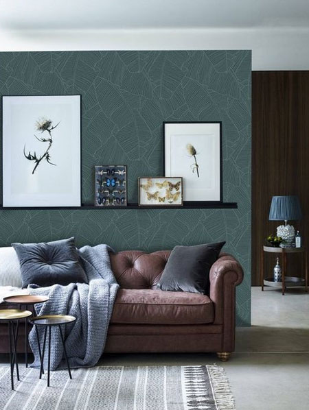
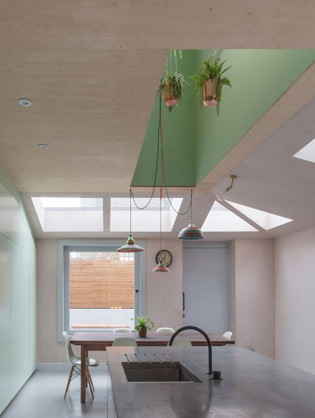
06 A balanced look
Once a room is painted, you will want to balance the colour palette. Balance cool colour schemes with some warm accents and add some cool accents to warm colour schemes to help balance them for a finished look. Did you know that green is a wonderful balancing colour? If you feel a colour scheme is not working out as you had hoped, add some green plants and you will be amazed at the difference.
https://pinterest.com - 324962929360896469/
07 Keep it neutral
Using a neutral colour as a base for your home interior is a excellent way to create flow throughout a home. If you do decide to go for an all-neutral colour palette, be sure to incorporate plenty of different textures like wood, steel and organic textiles like leather or wool.
https://pinterest.com - 555490935286807627/
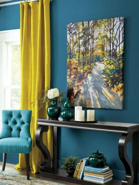
08 Work with contrasting colours
For the past few years, many of the rules we used for decorating have been tossed aside and colours that have a similar tone can now be used together. A deep blue and a sunny yellow for instance, can look great together but a pastel blue with a bright yellow may not work well at all. It is best to err on the side of caution and keep a pastel away from primary and secondary colour palettes. And never forget that neutral colours go with everything.
https://pinterest.com - 622481979723784469/
09 Incorporate interest and pattern
Small splashes of accent colours are an ideal way to add interest and uplift a flat colour scheme. Many people tend to ignore the 60-30-10 method, yet this comes in very handy when you want to decorate a room.
https://pinterest.com - 343540277811551492/
The 60 refers to the main colour used for 60% of your room - which is usually the wall paint colour. Trim or a feature wall in a similar shade and tone is used for 30% - this could be upholstered furniture and rugs or carpets. The last 10% is for an accent colour in a totally different colour and can be used for cushions and curtains or decorative pieces.
10 Use with tester colours
When finally selecting a set of colour, it is important to take into effect that natural and artificial light will affect the wall colour. Be sure to use tester colour pots or colour swatches and temporarily affix these on different walls of the room. This will allow you to see how the colour changes at different times of the day.
Also consider that when choosing an interior paint colour, the colour often looks darker and brighter when painted on the wall. To get the wall colour you are looking for you may need to go for a lighter and slightly more muted colour than the paint colour swatch you like.
Adapted from article via Private Property