
How to choose a bedroom colour scheme
Your bedroom walls are the first thing you see in the morning and the last thing you see at night, so choosing the right colour scheme could have a huge influence on your mood.
..
Colour theorists may suggest that red is energising, green is soothing and yellow is optimistic, but everyone reacts differently to colour so the important thing is to choose a palette that makes you feel good.
Top tips
- Colours can look completely different depending on the other colours used alongside them, so hold a paint swatch next to your furniture and other accessories before you buy.
- Paint the ceiling in a light colour to make the room feel higher.
- Use neutral and light colours in a small room as dark shades will make it feel cramped.
- Don't throw away any leftover paint as it will always come in useful for touching up scuffs.
- Speak to a colour expert at one of the paint stores or visit their website, as many suppliers have great online tools to help you create a scheme.
Get inspired
The first step is to become a sponge and really pay attention to the colour schemes that are all around you. Look at packaging, advertisements and even at nature for combinations of colours that work well together. Notice the way clothes shops put together displays and take inspiration from the showrooms in home furnishing stores.
Create a mood board with swatches of fabric, magazine cut-outs, and paint colours. A fantastic way to bring that relaxed and carefree holiday spirit into your daily life is to use your travels as a source of inspiration.
Think of different countries you have visited and the colours that spring to mind when you try to picture your experience using photographs, postcards and souvenirs to help you. Take the colourful mosaics and ceramics of Morocco, the textiles of Mexico, or the sunny hues of Italian architecture. Naples yellow and Sienna red even take their names from the towns in which they feature so strongly, which just goes to show how colour can evoke a particular time and place.
Colour theory
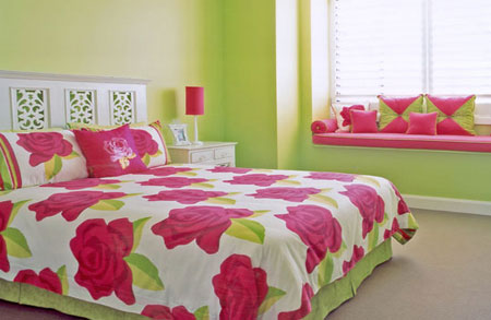
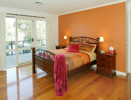
In order to work out which combinations of colours go well together you should start by looking at a colour wheel. Complementary colours are directly opposite each other on the colour wheel and are vibrant and energetic when used together. One way to use these contrasting combinations is to paint your walls in one colour, such as blue, and then use the complementary colour, in this case orange, as an accent through smaller objects like a lampshade or clock. Other pairs of complementary colours include violet and yellow, red and green.
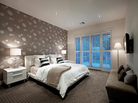
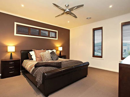
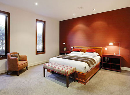
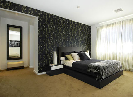
The colours next to each other on the colour wheel are harmonising, for example shades of blue, turquoise and green. For bedrooms, red is racy and seductive while blue is peaceful and soothing, but best avoided in cooler north-facing rooms. A relatively neutral shade is probably best for the carpet as you will not want to have to change this next time you want to redecorate the walls.
Creating a cohesive scheme
Paint mismatched pieces of furniture in the same colour to bring the room together. If you have a painting, photograph or fabric that you want to be the focal point of the room, isolate two or three of the most prominent colours to form the basis of your colour scheme and the piece itself will act as an anchor drawing all the colours together.
Use the background colour from this item for the walls as the main base colour in your scheme. Take a mid-range tone for larger furniture, curtains or bed linen and use the brightest colour as an accent tone for smaller objects like a lamp or vase that you want to really stand out in the room. Don’t rely just on swatches when selecting paint colours.
Take home sample pots and paint a large square on the wall and look at how it changes at different times of day. Always buy more paint than you need so that you use the same batch for the whole room as there can sometimes be a slight variation between different mixes.
love home