
The Colours of Summer 22/23 Bring It Home
They say home is where the heart is, and in the case of Plascon’s Summer 22/23 palette, home is where the paint is, too!
14/12/2022
Blue is any hue or shade brings about a feeling of cool and calmness, which makes it a very popular colour choice for sunny rooms, bedrooms and bathrooms. Lighten hues will instantly freshen up a space while darker shades will add drama and impact to a room setting.
With “homegrown” the theme of the summer
trend forecast for interiors and exteriors, the
colours for this season are heavily influenced
by what is wonderfully familiar and unique to us
here in South Africa. African landscapes, art
and design bring warmth, hope and a celebration
of nature to interior design directions.
Plascon has identified rich yet subtle
colours that look to our environment for joy and
comfort. The summer palette is bold without
being overwhelming or demanding, and combines
luminous pastels and deep brights. It features
nature-led colours such as earthy browns and
oranges, three different blue hues for sea and
sky, an olive green, and a more sombre purplish
berry tone.
Earth tones that contain a mix of red or orange are well known for their ability to add warmth to a room. These colours are beneficial in a room that does not receive a lot of sunlight during the day. Earth or organic colours can be used in larger rooms to evoke a sense of nature and harmony. Use it for a feature wall or as an accent colour in a neutral decorating scheme.
For those drawn to bold
directions, these uniquely African hues bring a
touch of drama. Rich pigments add depth to
lighter, neutral backdrops. They also pick out
the colours found in many traditional prints and
weaves, making them perfect for interiors that
reflect homegrown harmonies by incorporating
mudcloth and basketry.
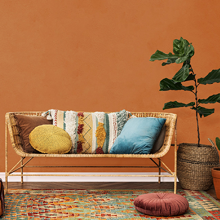
Directly inspired
by the earth and the different colours of soil,
from beach sand to riverbank clay, there’s
Plascon Coffee Shop (O2-D1-2) and Plascon Yellow
Mystery (Y4-B2-1), which tend towards the
chocolate brown and buttery cream, respectively.
Then there’s Plascon Baked Earth (O4-B1-1),
which is a vibrant orange reminiscent of the
iron-rich soil of KwaZulu-Natal.
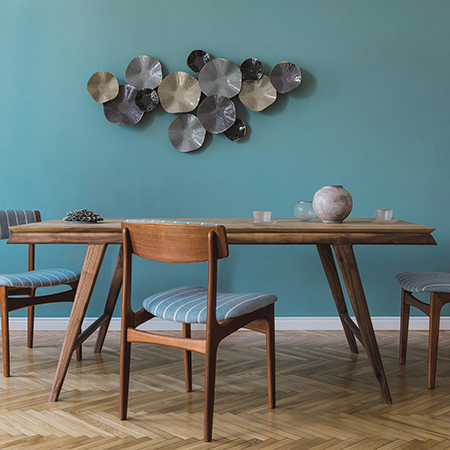
In
blues, Plascon River God (B2-D1-2) is a moody
teal with wonderful depth, while Plascon Pastel
Tint (G7-B2-2) is a soft, powdery sky tone.
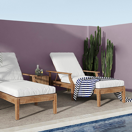
Plascon Granada Bay (B1-A1-3) recalls the
enticing blue of clear tropical waters or a
midsummer sky at noon.
As an alternative to the overly brightness of white walls surrounding a garden or relaxation area, look towards cool hues that will not reflect light and also bring about a sense of welcoming coolness.
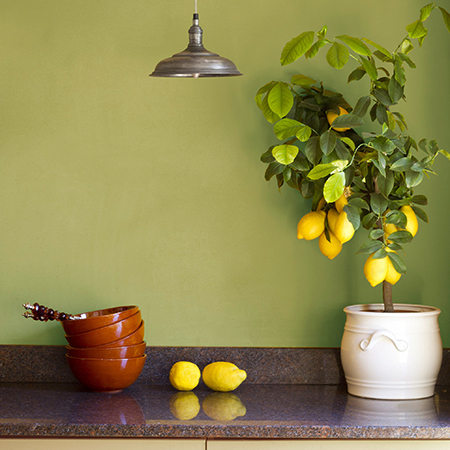
Plascon Lime Juice
(Y6-B1-2) carries hints of khaki in the
lemon-yellow and is a fresh green take on
plant-based tones. Plascon Berry Light (P6-D1-3)
is a summer nod to fingertips stained by
mulberries picked directly from the tree.
It’s a wonderfully familiar colour
landscape, and unique to us here in South
Africa.
Green has long been a colour associated with serenity, healing and nature in all its shades and hues. Darker greens are often used to add character to a room in any style, particularly in a traditional decorating scheme.
If you are looking for helpful advice on how to use the Plascon 2023 Colour Forecast or for information on any other Plascon products or colours, please contact the Plascon Colour Advice team via email: ColourAdvice@kansaiplascon.co.za. Visit plascon.com for more information.