
Find Hygge in the Home with Plascon’s Winter Palette
Now, as temperatures drop, Plascon is introducing its Graphic palette, comprising a combination of monochromatic urban hues and sleepy darks that engender feelings of comfort and serenity.
24/05/2023
Looking to bring warmth and wellbeing into your life this winter?
In keeping with Plascon’s 2023 theme,
‘Bringing it Home’, this year’s colour trends
are looking inwards to our homes, family and
friends. Summer saw sun-drenched naturals
beaming their way onto our walls, while autumn
brought transitional emotions to life with
decorative pastels.
Now, as temperatures
drop, Plascon is introducing its Graphic
palette, comprising a combination of
monochromatic urban hues and sleepy darks that
engender feelings of comfort and serenity.
Whether you're cuddled up with a good book or hosting a cosy night in, this winter colour palette is sure to bring joy to your home.
In search of wellbeing, we look closer to
home: to our native environment, our culture,
our loved ones, and of course ourselves. This
approach echoes the Danish concept of ‘hygge’
(pronounced ‘hoo-gah’), which is, in essence,
fostering qualities of cosiness and comfort to
enhance our wellbeing – think cosying up under a
down duvet while rain patters on the roof,
reading a book next to a roaring fire, or
warming our insides with a steaming cup of tea.
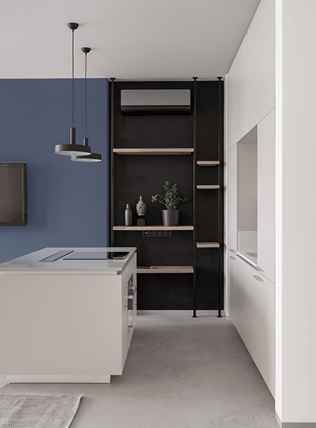
Plascon’s new winter Graphic palette features a selection of cool neutrals, distinct contrasts and rich pigments that foster this harmonious hygge-full environment without forfeiting bold design potential.

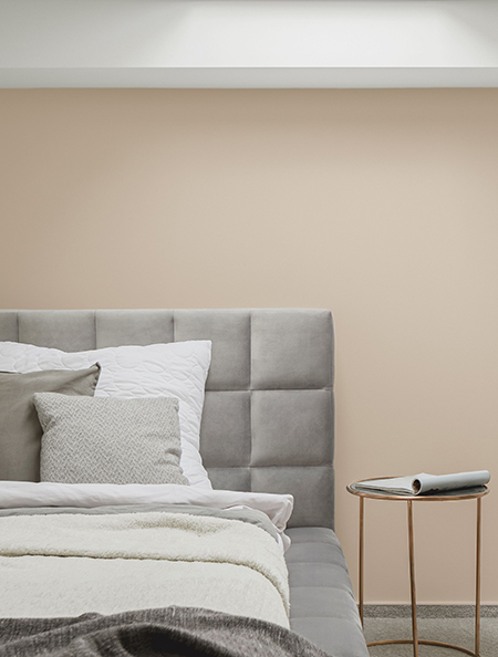
Set the
tone for the season with an assortment of gentle
neutrals that provide the ideal base for
interiors. The cooler grey and ivory hues of
Lagoon Mirror (3), Geneva Morn (51) and Mandarin
Tusk (49) mirror the frost and create tranquil,
sophisticated atmospheres, while mellow Bleached
Baobab (Y2-C2-2) with its beige undertones
brings warmth from the winter sun inside.
Rich, deep blues like Ocean Melody (B6-D1-2)
lend an indulgent feel to interiors, making you
want to curl up and snuggle, as does the smoky
and beautiful Steamy Shadow (P3-E2-1) muted
purple that emulates a dusky sky just before it
goes dark.
Play around with Plascon’s 2023 Graphic winter colour palette with its combinations of versatile neutrals and bold
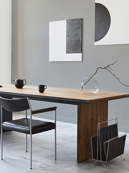
Meanwhile, for those drawn to
the bold, a combination of the robust Red Flame
(R7-A1-1) and the almost-black Phantom Ship (60)
delivers a sharp graphic edge amid gentler hues.
To bring hygge to life, play around with
these combinations of versatile neutrals and
eye-catching tones to create the perfect balance
between comfort and excitement. As the Danes
would say, find the extraordinary in the
ordinary!
For free advice on how to use
the Plascon 2023 Colour Forecast or any other
Plascon colours, please contact the Plascon
Colour Advice team via email:
ColourAdvice@kansaiplascon.co.za. Visit
plascon.com for more information. #Plascon
#WinterColourPaletter