
What's your favourite colour?
PANTONE Honeysuckle emboldens us to face everyday troubles with verve and vigour.
A dynamic reddish pink, Honeysuckle is encouraging and uplifting. It elevates our psyche beyond escape, instilling the confidence, courage and spirit to meet the exhaustive challenges that have become part of everyday life.
Honeysuckle is a captivating, stimulating colour that gets the adrenaline going – perfect to ward off the blues. Honeysuckle derives its positive qualities from a powerful bond to its mother colour red, the most physical, viscerally alive hue in the spectrum.
Honeysuckle and Nature
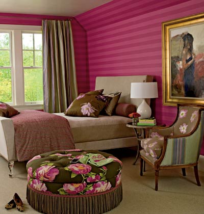
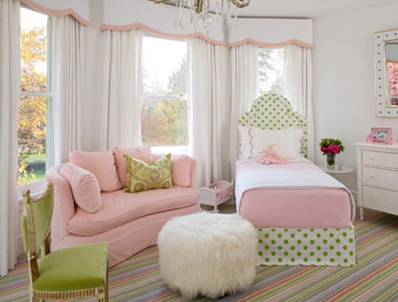
In a teen’s room the honeysuckle-striped wall adds a touch of glamour. Run on the horizontal (a technique called "railroading"), it looks modern but is cosy. Large-scale floral prints on the ottoman, chair, and pillows echo the walls, but their similar chocolate brown background colours don’t compete for attention.
A smaller scale stripe with pinks, greens, and browns (on the curtains and back of the chair) ties the room together. As with any bold colour, the key is to use the right amount in the right intensity. Too much colour can easily overpower a room. Consider introducing small accents.
Moody Blues
The color blue has been associated with just about every fashion trend in history. From Chinese blue-and-white porcelain to Levi's jeans, there is no denying its presence in our culture. It signifies constancy, and its versatility makes it perennially popular. It can be bright or sedate, traditional or ultramodern, classic or trendy.
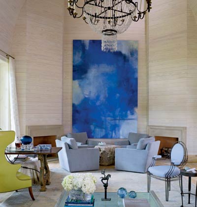
To keep the double-volume space from overwhelming the space, a restful colour palette was chosen for this room and tied in with adjoining rooms. A muted rug defines the space, and a dramatic chandelier draws the eye up. Whitewashed wood panels running horizontally on the wall contribute more texture than a painted wall and frame the larger-than-life painting.
A wingback chair in lime green echoes the colours of the fresh flowers on display and provides just a small punch of colour. Blue's richness almost guarantees a compelling interior, whether on a small or large scale.
In a warm climate, such as ours, blue's softer shades are used to cool a room. Where warmer shades are preferred, greener blues are more desirable. Blue often appears in bedrooms and nurseries (it's not just for boys) and as a pale colour in living rooms.
Jaded Rooms
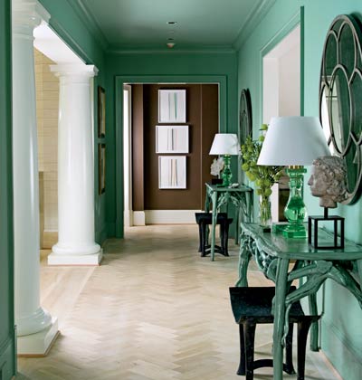
Inspired by a colour discovered in a historic house, the space is swathed in a soothing shade of jade green. Even the console tables are painted the same colour with a grey wash on top. Malachite boxes and green glass lamps continue the palette.
Because we are surrounded by greenery in nature, it is refreshing to bring in one shade or a few variations, to pull them out of their environment and give them a new look. When you're seeking a neutral tone but still want colour, green is a great choice. From the bold Kelly greens that appear on floral-printed chintzes to subtle limestone and mint and vibrant chartreuse, green is chameleonlike in its ability to take on alternate identities.
Green may be a restful colour, but it suggests vitality because its inspiration springs from life and growth.
Mediterranean Moments
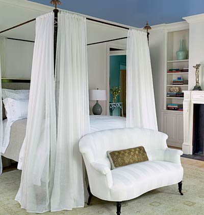
In this master bedroom, white walls and bed curtains create a clean backdrop for a variety of blues. A Mediterranean-inspired blue ceiling creates a soothing, restful retreat.
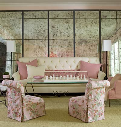
Playful in Pink
In many cases, a patterned fabric isn’t meant to steal the show but to add to it. In this sitting room, the soft colours and subtle fabrics contrast with concrete floors and the statement-making antiqued mirror behind the sofa. The room could stand alone without the floral-printed slipper chairs, but it is much more interesting with them.
Pink seems almost synonymous with spring. As azaleas bloom and tulips flower, the landscape comes to life. But pink is present year-round, in our favourite china, rugs, and window treatments. Designers suggest using varied tones. In shades of intensity, pink shows up in living rooms and master bedrooms, and of course, in little girls' rooms. Vibrant fuchsia accents can enliven a space, and lampshades lined with pale pink will cast a warm, welcoming glow.
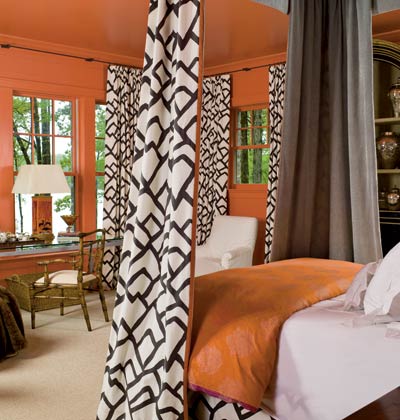
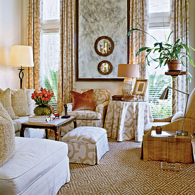
Overstated Orange
Using patterns together is all about balance and scale. Here, a graphic geometric pattern is dramatic and effective when it could have overwhelmed. The trick is the spare use of other colors and patterns. A very small stripe at the edge of each drape complements the bold fabric.
Painting the walls, trim, and ceiling the same shade at this stripe prevents the eye from being stopped all around the room. One no-fail trick when working with orange is to pair it with the colours found beside it in nature. In the spring, shades of orange used with fuchsia, persimmon, and lime green create stirring combinations.
Other unexpected duos, such as tangerine paired with baby blue or jade green, are just as delicious.
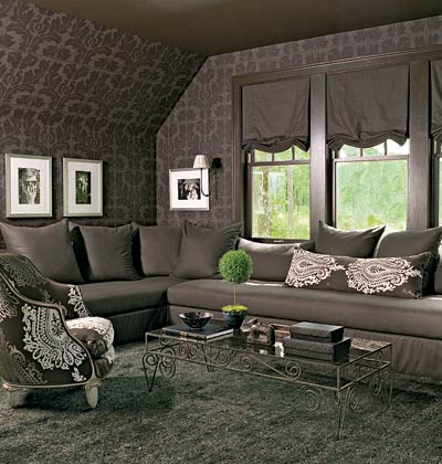
Mellow Monochromatic
Tone-on-tone wallpaper and paint and fabric in the same shade create an intimate space. The shag rug adds some interest, and pops of white (on the accent chair, art, and sconce shades) break up the monochromatic palette.
Blushing spaces
Just a hint of colour on a white background with a fabric pattern that is fun and neutral enough to work in almost any space. The woven rug contributes to the colour palette and brings lots of texture.
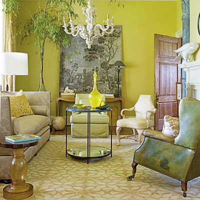
Let the sun shine in
With its versatile nature and sunny-side-up appeal, it’s little wonder that yellow is a perennially popular choice for interiors. In this room the underlying theme is organic, with leaves in the rug and in the scenic panel in the background. Yellow walls are bound to lift your spirits.
Before you pick the shade, decide whether you are looking for zing or Zen. Yellows such as pale citron or mellow ocher are usually easier to incorporate than high-voltage tones, which can quickly become overbearing. Yellow can be difficult to picture accurately, so it may take a few attempts before you find the shade you had in mind.
Colour doesn’t cost you much to experiment with and paint is one of your least expensive media. I’m big on painting blocks of a color on walls so you can live with it and see if you like it. After a few days, you’ll have a clearer sense of whether that daffodil hue is refreshingly jaunty or just plain awful. Use daffodil yellow with chocolate brown, black, red, or turquoise for a bold look; white or other yellows for a softer look.