
Paint Choices Make all the Difference in a Compact Home
An increase in interest rates and the higher cost of living is putting pressure on everyone to re-examine their lifestyle choices, with downscaling being one of the options.
06/07/2023
A sharp increase in interest rates
and the rising cost of living is putting
pressure on consumers to re-examine their
lifestyle choices, with downscaling being one of
the options for homeowners who are feeling
financially squeezed.
But it’s not only
those who are watching their wallets who are
making this move. ‘Empty-nesters’, whose kids
have grown up and left home to study or work,
are also looking to move into complexes and
residential estates in central locations. ‘A
smaller home with less maintenance appeals
particularly to this generation,’ notes Suvasin
Moodley, head of decorative marketing at
Plascon. ‘This is because selling a big home
frees up cash for new hobbies and longed-for
travel experiences. Plus, there’s more of a
community spirit in an estate than in a
neighbourhood with high walls and large
properties.’
Individuals who work from home and young families also tend to favour this type of living arrangement, in which gyms, squash or tennis courts, a golf course and even jogging paths are laid on to encourage an active lifestyle, and where kids can cycle and play in the streets due to excellent security, vigilant neighbours and regulated traffic speeds.
One of the adjustments these downscalers have to make is in their interior décor choices for their smaller living spaces, and paint colour plays an important role in this.
‘While there is likely to already be a recommended neutral-spectrum colour code for the exterior of a compact city-based townhouse estate, the Plascon palette is truly your oyster when it comes to its interior,’ says Moodley.
The
rule of thumb when creating an interior design
scheme, she says, is that neutrals, greys,
whites and rich bluey-greens all contribute
towards making an interior feel several degrees
more spacious, not to mention having a broader
appeal when it comes to re-selling. A fresh coat
of slightly off-white paint, like the popular
Plascon Ray of Light (07-A2-3), provides a
clean, updated look without minimising the
surrounding space.
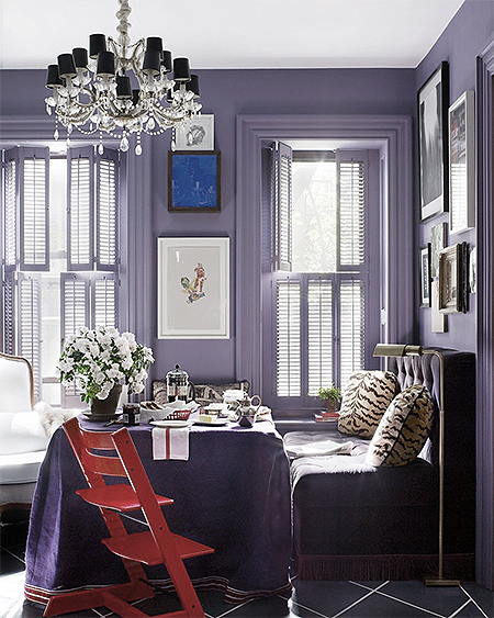
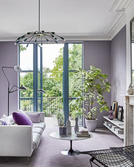
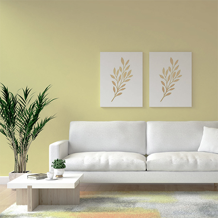
In the living room –
generally the epicentre of any small-scale home
– an inviting statement that doesn’t overpower
the entire room can be achieved by painting one
key wall a bold but soothing colour such as
Plascon Eye of the Storm (B7-C1-1). And adding
touches of a muted grey, such as Plascon Serene
Setting (B3-C2-2), around a large window, can
create a dynamic effect as the light changes.
In a space that leads out onto a garden or balcony - a bright and breezy hue – think Plascon Whipped Cream (07-B2-3) – is a good bet for the walls (and floors too), to bounce natural sunlight all around the room. And for smaller apartments on upper storeys that may feel far from any soothing greenery, a choice like the highly popular Plascon Mulberry Leaf (G1-C1-1), especially in a study or as a feature wall colour, is a natural friend in its ability to offer much-needed eco-friendly calm.
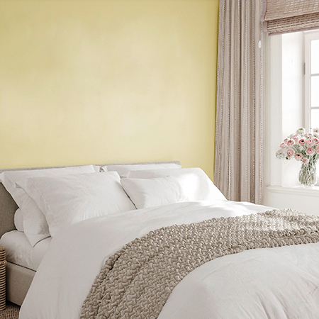
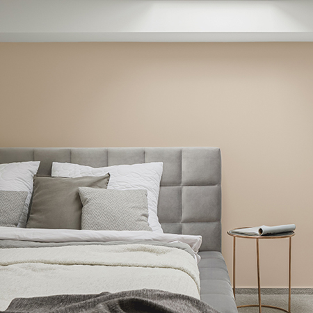
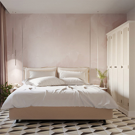
in
the bedroom or bathroom - where downtime in the
form of a snooze or a restorative soak in the
bath is typically sought, a soft, cool grey like
Plascon Ripple (34), or a warming neutral such
as Plascon Cream of Mushroom (32), may offer the
perfect cocooning effect.
For more information visit www.plascon.com.