
Colour A Productive Home Office
When it comes to choosing Plascon colours for home workspaces, there are a few handy guidelines that can be followed.
22/08/2023
Working from home,
or partly from home and partly from the office,
is a change that’s proving hard to reverse.
Many people report higher job satisfaction,
mental health and#overall wellbeing than
their counterparts who have returned to
full-time office work.
This new reality
created some new interior design needs, as
people looked to create or improve permanent
spaces within their homes where they could
continue with their jobs. A workspace is, after
all, decidedly different in nature from a
conventional home space such as the kitchen –
unless you’re a chef, of course!
Now that working from home has been with us all for almost four years, the new consideration is ongoing maintenance and/or revamping of the home office in a way that will continue to encourage productivity.
If you want to create a sense of wellness, or work in the healthcare sector, then a soft light green is a wise choice because it is known to be a healing colour. Lighter pastel colours, such as Isle of Green (G2-A1-4 ), are calming.
Colour is an easy way to
update an interior. When it comes to choosing
Plascon colours for these home workspaces,
there are a few handy guidelines that can be
followed, and some valuable insights from
colour psychology to help steer choices in the
right direction.
People instinctively
know what colours resonate with them, what
‘feels right’, but not everyone knows why
this is the case. The reason why some colours
encourage positivity and are uplifting and
others are, well, just downright gloomy has to
do with more than simply context. Colour
comes from light and is part of the
electromagnetic spectrum, with each
individual colour having its own unique
frequency or wavelength. Those on the ‘cool’
side of the spectrum have shorter wavelengths
(with violet having the shortest), while those
on the ‘warm’ side have longer wavelengths
(with red having the longest).
According
to colour psychology, cool tones are the most
stress-reducing shades, so they are ideal for
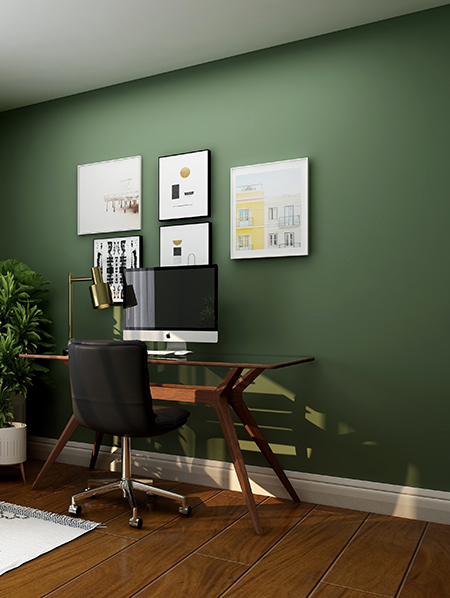
a home working environment. Greens, blues and
green-blues are all colours that put people
at ease because they bring a sense of
tranquillity. These shorter-wavelength
colours are less agitating, so if you work in a
fast-paced industry, then opting for a cooler
tone such as Green Light Go (G2-A1-2) or
Mulberry Leaf (G1-C1-1) can help contribute to
easing work stress by inducing a sense of
calmness.
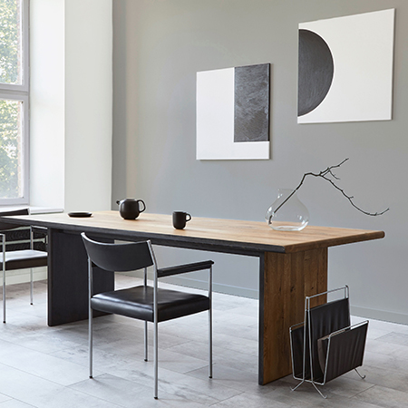
If you’re a fan of the warmer shades, brown, taupe or sand hues can keep walls from looking dreary.
There’s also the climate and location of the room to consider when choosing colours for a workspace. The general rule is that if the walls are painted in cool colours, the room will feel cooler than it would if the space were painted in warmer hues. So a space that receives a lot of sunlight, or which isn’t well insulated, and thus is hard to cool, benefits from the use of a cool colour.
Opting
for a neutral white or grey - which are
considered neither warm nor cool - is always a
safe choice. But white comes with its own
issues: it reflects the highest amount of light
and heat, so a pure-white room can be
energy-draining. Also, if you are working in
front of a computer all day, then white is
best avoided, as the glare caused by the high
reflective properties of white can cause
optical fatigue, resulting in excessive strain
on the eyes and, as a result, affecting
productivity levels in an office-like
environment.
Neutral colours may appear
to lean more toward one side of the spectrum,
depending on their undertones - for instance,
a cream colour with a yellow undertone will
appear warm, while a grey with blue
undertones may seem cool. If you’re a lover of
neutral colours, rather look to an off-white,
such as Sandy Bay (87), Lagoon Mirror (3) or
Afternoon Shower (Y4-C2-3).
When it
comes to the use of bolder colours, blue is
calming, and aids productivity focus and
communication, which makes it ideal for meeting
rooms. That said, too much blue can become
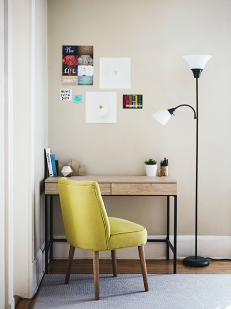
cold. Yellow is energising and stimulating, and
ideal for an accents in a room. Red should be
used sparingly, as it is overstimulating - an
individual with anger issues, for example,
will be pushed into an agitated state when
exposed to a wall painted in this colour.
Instead, deeper, richer colours are better
because they give a more comforting, homey feel,
even if you are working.
When deciding
which colours to use in your work-from-home
space, these choices should be made with
plenty of consideration for not only the area
being painted, but also the individual using it.
For more advice on what colours are best to use where, and why, please contact the Plascon Colour Consultancy via email: colouradvice@kansaiplascon.co.za.